Personality test
By LaunchMyCareer
Mobile App & Illustration • 2022
Role
UI/UX Designer
Timeline
4 weeks
Team
Me 😎, Deepesh, Paras (3d Modeler)
My role in this project
At LaunchMyCareer, we identified an opportunity to revamp personality quiz offered by LMC. It was as long as mountain trek for a K-12 students, leaving students bored and overwhelmed till the finish of test. The central challenge was the high drop rate of test, signaling a need to revamp our user experience to engage students more effectively and the task accurately.
As the UI/UX Designer, my responsibility was to transform the quiz feature into a vibrant, engaging and interactive platform. Our vision was not just to finish the task accurately but to deliver the better career and education path to student based on their personality types.
Results
➡️ 70% of testing users found the redesigned LMS more intuitive and easy to use.
➡️ 80% of testing users felt more engaged with the process due to levels stops.
➡️ 90% of testing users were more satisfied with their career guidance mapping approach through their personality type
➡️ Reduced churning rates, Increased user retention, and a lot of happy students and parents.
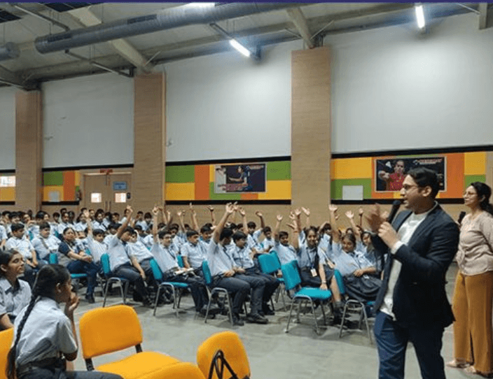
Research
We conducted a school session with the helps of our sales team to gather insights and observation about their experiences with the current product. Here's what they shared:
⚡The personality test are too lengthy for them.
⚡The test process feels monotonous without any interactive elements. There are lot more which is coming.
⚡The user interface is outdated and not intuitive. It's confusing.
⚡They do not know when this test will be end it feels like they are doing it for ages.
⚡After answering several questions, they just randomly clicking here and there to finish the test.
Goals
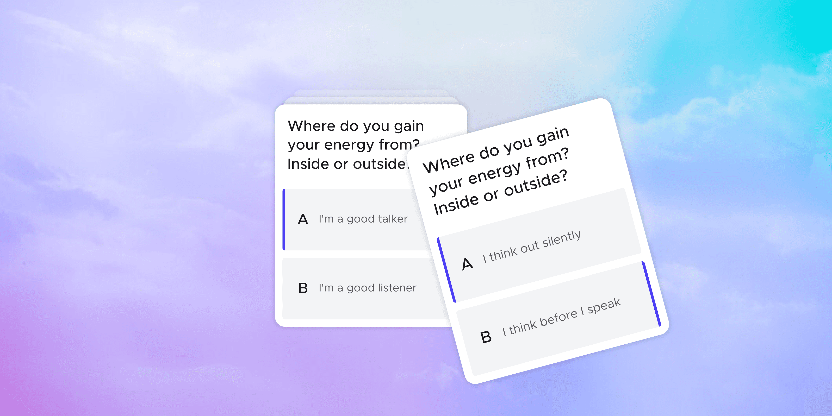
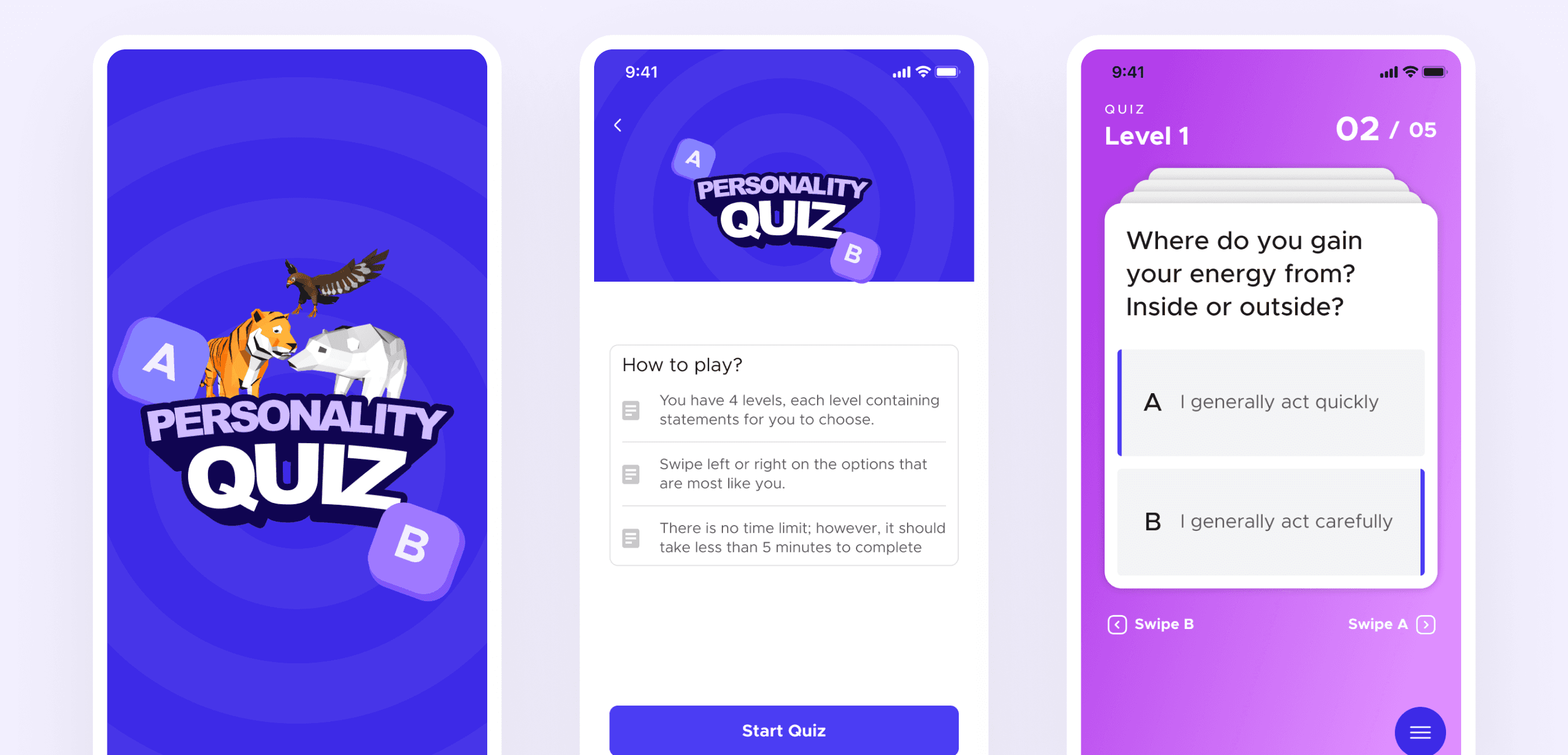
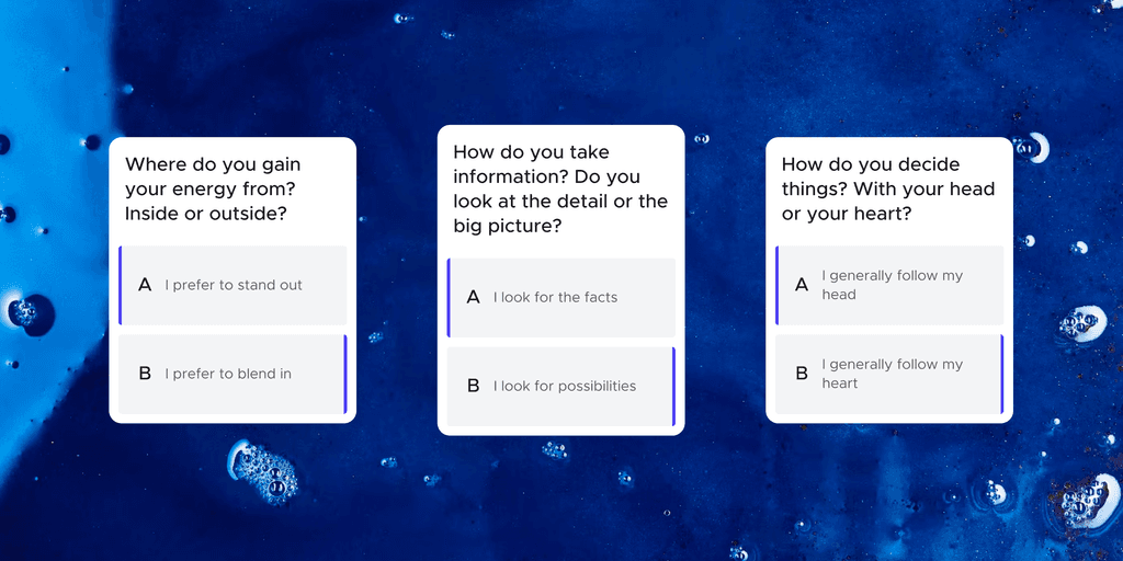
Goal 1: Reducing the question clutteration
Users found it difficult to continue after a certain points to choose between one option which increase the inaccurate results. To address this, we aimed to improve the process flow with more minimal and intuitive approach.
Additionally, we decided to introduce a checkpoint system making it easier for students to take a breath before jumping to other set of questions.
Goal 2: Better track of progress
Students found it difficult to measure their progress and understand what tasks were left, leading to rushed decisions out of frustration. In response, we've enhanced the progression tracking system, including four steps for every set of five questions. This allows students to easily assess their advancement, fully comprehending their successes and remaining questions.
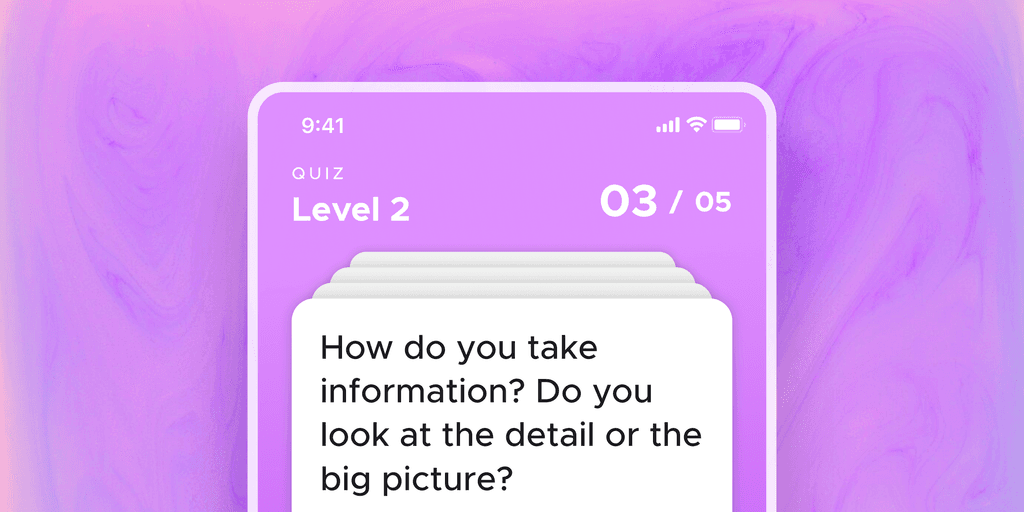
Goal 3: Enhancing visual harmony
As we get the feedback from students that the design of platform are outdated and overcolored which is confusing for them. So we decided so change the visual harmony with more minimal and modern approach.

Success Metrics
After successful release we gathered the insight of the new changes with the help of sales team and we found that the new changes helps student to finish the quiz easily without getting bored or frustrated. Due to the update the accuracy of the results are significantly increases because user are giving more focused answers without clicking here and there. Also participants found the new personality quiz more intuitive and engaging compared to the previous.
Learnings
Technically, this project allowed me to explore gamification in ed-Tech, with features like career mapping, quizzes and study abroad.
More broadly, the project reinforced the value of user-centric design. The changes we made were visually drastic as well as significantly improved the user experience. This taught me that impactful redesigns focus on solving the right problems as well as the impact of those changes.
The project also highlighted the importance of iterative design and testing, shaping my approach to future design projects.
Hmm! Want to know more?
This is just a quick go through about the project want o know more about the decision I made and How?
Check out more projects